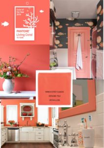
The Pantone Colour Institute has been influencing Design for over 40 years. They developed the Pantone Colour System to solve the problems of colour matching in the printing industry;  creating a catalogue of every colour in every hue and classifying it with its own unique number.
In 2000 the Pantone Colour Institute created the Pantone Colour of the Year. They inspire, set trends, ideas, concepts that filter down into all aspects of creativity and design for the year.
This year is no exception and the colour that they have chosen is not as hard as you might think to incorporate into your life.
Living Coral is a soft, feminine hue with warm gold undertones.
It works well alongside more neutral shades, so if you don’t fancy going full on accent wall with paint, bringing the colour into your home with a subtler approach can work towards your quest to being bang on trend.
Bring some early spring into your home by popping to your local florist. There are many a coral coloured flower to choose from, but I’ve always had a fondness for tulips, the rich colour against the green really pops. Place them in your entry way, or on the dining room table.
In the Kitchen, think about replacing your kitchen splashback with some Coral tiles. The one above, from the Winchester Tile Company in Vermillion will add colour to the room, and pairs well with kitchen units in cream and light grey.
Switching out your sad white bath towels for these bright ones from John Lewis, brings the trend into your bathroom.
Pantone will be sure to make Living Coral a hit, they’ve been being doing this for years. Watch as it slowly creeps in throughout the year. A promise of warmer days and sunshine to brighten these cold Winter days.
It will work through Autumn as well, with the changing of the leaves outside, until December comes, and we can look forward to a new Colour of the Year.
Then the fun begins again, on how to reach colour trend nirvana!
